Halloween avatars make this spooky season boo-rific!
- Designerds
- Oct 31, 2024
- 3 min read

Branded profile images offer a fun way for agencies to connect with audiences and each other
For creative agencies, avatars are more than just fun animations. They provide a brand-safe pathway for staff to express themselves and have fun while doing it!
Us Designerds love a good excuse to show off our creative side in a way that showcases our unique personalities.
This year, we upleveled our game by creating a new Halloween pack that our nerds used to revamp their avatars just in time for spooky season.
Follow along as we walk you through the creative journey from origin story to the latest haunting updates.
The story behind our Designerd avatars
In 2022, as part of our rebrand, where we brought our two business units under one unified banner, it was important to step out with a strong presence representative of our work ethic and fun-filled natures. So, we created a build-your-own avatar pack for our nerds to construct their own personal profile representations.
These avatars were constructed from base shapes and colors and would be used for staff cards on the website, as profile images in Slack and even on Zoom calls.
Those of us on the team who were less digitally skilled got to pair up with a designer who helped build a special avatar that colorfully exemplified each person’s unique personality.
Incremental updates
Over the last two years, as time allowed, different team members would develop “specialty packs” that brought in new shapes and design elements such as facial hair, hats and other accessories.
While the first bucket of building blocks kept things more basic for avatar construction (solid colors and simpler shapes), the newer packs took on more intricate aspects and allowed for even greater customization and self-expression by incorporating patterns and shading.
2024: Halloween gets a branded boost
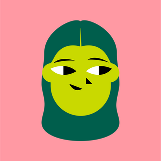
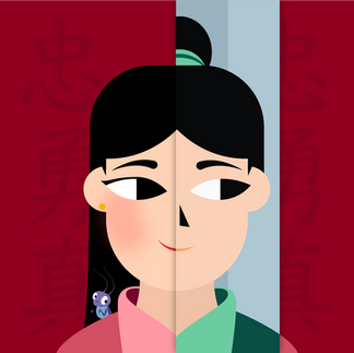
This year, as many of us love to nerd out on Halloween, spooky season got the full Designerds treatment. We re-imagined our avatars as iconic characters and other pop-culture references! From Beetlejuice to Monsters, Inc., and even a candy corn in the mix, the team dressed up our avatars with a new pack of costume elements.
Whether it’s collaborating on creative briefs or simply chatting on Slack, these avatars have brought the Boo to everything we do over the last month.
We’ll have to start planning our holiday updates next!

Considerations for building your own branded avatars
So, if your team is thinking of exploring these fun-filled digital personal representations, there are a few considerations you’ll want to keep in mind:
Inject plenty of personality: Just like a Halloween costume, consider what aspects of your team’s likes and characteristics they might want to highlight.
Focus on your base building blocks first: Different shapes evoke different emotions. Rounded edges might feel friendlier, while sharp angles can make your design feel more dynamic or edgy.
Have clear rules for use in place: The more you add, the more possibility of issues cropping up concerning color and contrast. Make sure you clearly define what components can and cannot be used together.
Keep it simple, spooky: Avatars are often viewed at small sizes, so stick to simple, bold designs that are easy to recognize and don't lose their charm when scaled down.
Our avatars highlight how even the small things at work can help foster connection and team spirit. This is particularly impactful when you have a team that is fully remote and communicates almost entirely through digital channels.
With every new avatar design, we celebrate our team’s individuality and keep internal conversations fun and fresh.
Ready to see how spooky things get around here? Check out our avatar gallery for some ghoulish inspiration!


Comments